https://dacon.io/competitions/open/236066/overview/description
데이콘 Basic 풍력 발전량 예측 AI 경진대회 - DACON
분석시각화 대회 코드 공유 게시물은 내용 확인 후 좋아요(투표) 가능합니다.
dacon.io
Dataset Info.
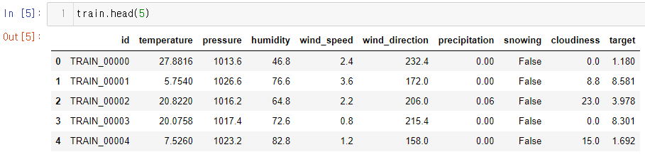
- train.csv [파일]
- 19275개의 데이터
- id : 샘플 별 고유 id
- temperature : 기온 (°C)
- pressure : 기압 (hPa)
- humidity : 습도 (%)
- wind_speed : 풍속 (m/s)
- wind_direction : 풍향 (degree)
- precipitation : 1시간 강수량 (mm)
- snowing : 눈 오는 상태 여부 (False, True)
- cloudiness : 흐림 정도 (%)
- target : 풍력 발전량 (GW) (목표 예측값)
- test.csv [파일]
- 19275개의 데이터
- id : 샘플 별 고유 id
- temperature : 기온 (°C)
- pressure : 기압 (hPa)
- humidity : 습도 (%)
- wind_speed : 풍속 (m/s)
- wind_direction : 풍향 (degree)
- precipitation : 1시간 강수량 (mm)
- snowing : 눈 오는 상태 여부 (False, True)
- cloudiness : 흐림 정도 (%)
- sample_submission.csv [제출양식]
- id : 샘플 별 고유 id
- target : 풍력 발전량 (GW) (목표 예측값)
1. EDA (Exploratory Data Analysis, 탐색적 데이터 분석)
데이콘에서 주최하는 베이직 대회이다! 들어가면 예시코드 등을 따라하면서 데이터 분석에 대한 기초적인 내용을 배울 수 있다. 코드 공유를 누르면 데이콘 측에서 올려놓은 Baseline 코드와 EDA를 참고할 수있다! 일단은 먼저 기본적인 EDA를 사용하여 데이터가 어떤 컬럼과 형태를 띄고있는지 확인해 보자!
# 사용할 라이브러리
import numpy as np
import pandas as pd
import seaborn as sns
import matplotlib.pyplot as plt
from sklearn.preprocessing import LabelEncoder
from sklearn.linear_model import LinearRegression
%matplotlib inline

train = pd.read_csv('train.csv')
test = pd.read_csv('test.csv')
submission = pd.read_csv('sample_submission.csv')

train.info()
test.info()
info를 통해 train 데이터를 확인해본 결과 따로 null 데이터는 존재하지 않았다. test 또한 마찬가지이다. 데이터 타입은 id, snowing 컬럼을 제외하고 float64 이다. id 컬럼은 데이터 분석에 의미있는 정보가 아니기 때문에 삭제하고, snowing 같은 경우 라벨 인코딩을 통해 정수화 시켜줄 것이다.
이제 히스토그램을 사용하여 데이터의 형태를 살펴보자.
# 질적 변수
qual_df = train[['snowing']]

# 양적 변수
quan_df = train.drop(columns = ['id', 'snowing'])

quan_df.hist(bins=100, figsize=(18, 18))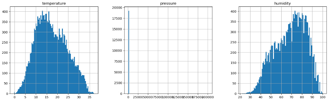
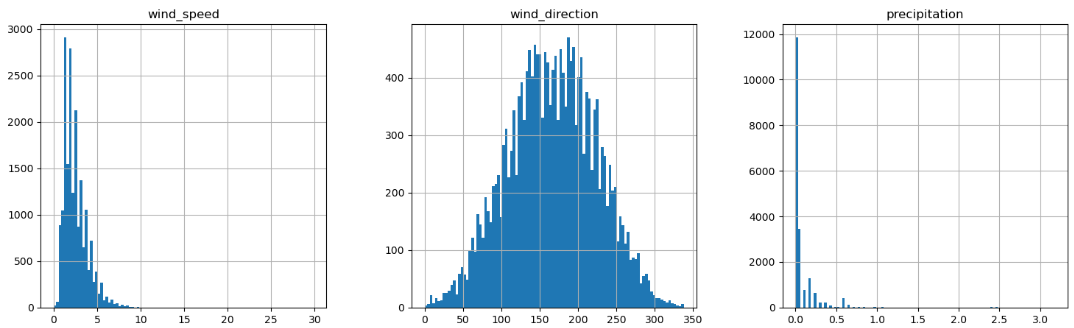
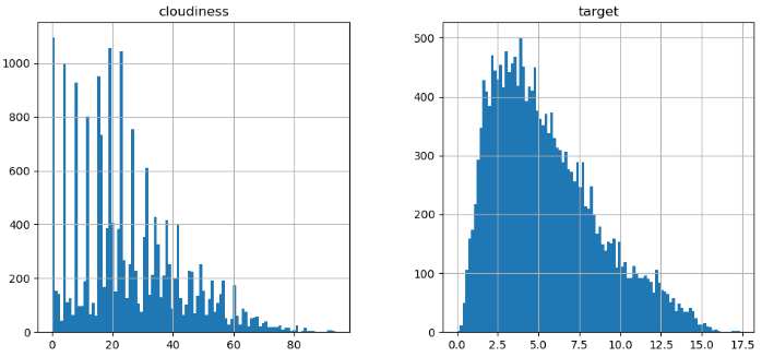
일반적으로 데이터는 정규분포의 형태를 띄우고 있는데, 그래프를 살펴보면 pressure, precipitation 컬럼이 이러한 형태를 벗어나고 있는 것으로 보아, 이상치처리를 통해 데이터를 가공해야 할 것 같다.
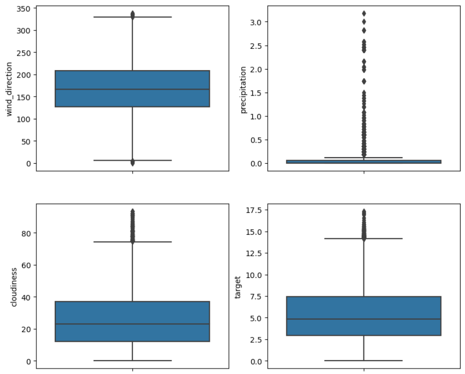
마찬가지로 boxplot 을 통해 서도 확인해보자.
#이상치 확인
fig, axes = plt.subplots(4,2, figsize=(10,18))

sns.boxplot(y = quan_df['temperature'], ax=axes[0][0])
sns.boxplot(y = quan_df['pressure'], ax=axes[0][1])

sns.boxplot(y = quan_df['humidity'], ax=axes[1][0])
sns.boxplot(y = quan_df['wind_speed'], ax=axes[1][1])

sns.boxplot(y = quan_df['wind_direction'], ax=axes[2][0])
sns.boxplot(y = quan_df['precipitation'], ax=axes[2][1])

sns.boxplot(y = quan_df['cloudiness'], ax=axes[3][0])
sns.boxplot(y = quan_df['target'], ax=axes[3][1])

sns.boxplot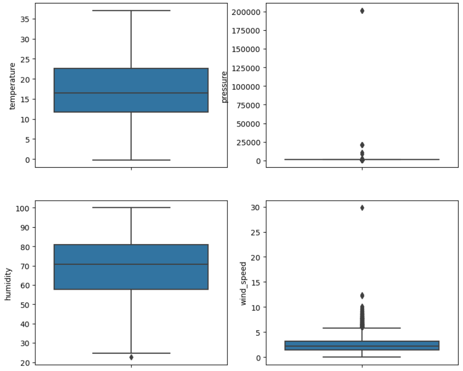
상관관계 히트맵을 살펴보자!
#상관관계 히트맵
plt.figure(figsize = (15,15))
sns.heatmap(train.drop(columns=['id'], axis=1).corr(), annot = True, fmt = '.1f', linewidth = 1, cmap = 'Blues')

plt.show()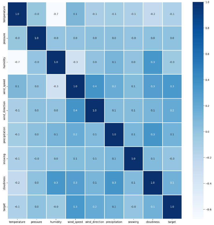
우리가 중요하게 생각하는 컬럼은 target 이고 이와 가장 연관도가 높아보이는 컬럼은 wind_speed, wind_direction, precipitation, cloudiness, temperature 순이다!
2. 이상치(outlier) 처리 및 pre-processing
다른 컬럼들이 비해 train, test의 pressure 의 이상치가 가장 눈에 띄였으므로, pressure 컬럼의 이상치를 제거해보자!
일반적으로 이상치는 IQR(Inter Quantile Range)를 사용하여 처리를 해 주는데, 이는 데이터 셋의 제 3사분위값과 제 1사분위값의 차이를 의미한다.
def get_outlier(df, columns, weight):
    df = df[columns]
    q25 = df.quantile(0.25)
    q75 = df.quantile(0.75)
    iqr = q75 - q25
    iqr_weight = iqr * weight

    lowest = q25 - iqr_weight
    highest = q75 + iqr_weight
    print("lowest", df[df < lowest])
    print("highest",df[df > highest])

    return df[(df < lowest) | (df > highest)].index
이 함수를 사용하면 lowest보다 아래의 데이터와 highest 위의 데이터의 인덱스를 반환한다.
# 원본 데이터를 보존하기 위해 train을 copy한 df_train을 만들어준다
df_train = train.copy()
outlier_index = get_outlier(train, 'pressure', 5)
df_train.drop(outlier_index, axis = 0, inplace = True)
get_outlier 함수를 통해 반환받은 인덱스를 outlier_index에 할당하고 drop 시킨다. test 데이터에도 마찬가지로 적용시켜 준다.
df_test = test.copy()
# 양적 변수
outlier_index = get_outlier(df_test, 'pressure', 5)
df_test.drop(outlier_index, axis = 0, inplace = True)
이제 bool 타입이었던 snowing을 라벨 인코더를 통해 변환한다.
# train 데이터
train_x = df_train.drop(columns=['id', 'target'])
train_y = df_train['target']

# test 데이터
test_x = test.drop(columns=['id'])

le = LabelEncoder()
le = le.fit(train_x['snowing'])
train_x['snowing'] = le.transform(train_x['snowing'])

for label in np.unique(test_x['snowing']):
    if label not in le.classes_:
        le.classes_ = np.append(le.classes_, label)
    test_x['snowing'] = le.transform(test_x['snowing'])
print('Done')
이제 데이터를 다시 확인해보면,

데이터가 모두 float과 int로 변환되어 있음을 확인할 수 있다. 이제 모델에 넣어 학습시켜보자!
LR = LinearRegression()
LR.fit(train_x, train_y)
preds = LR.predict(test_x)
학습 이후에 제출할 파일에 예측해놓은 결과를 넣는다.
submission['target'] = preds
submission.head()

submission.to_csv('submit.csv', index=False)
이제 DACON에 내가 직접 예측한 데이터를 제출해본다!

제출결과 약 3.8에 대한 결과를 받을 수 있었는데, baseline 코드의 결과와 비교해 봤을때 더 낮은 점수를 받았다. 아마 이상치 제거를 잘못했거나 이상치가 아닌 경우일 것 같은데.. 일단 다른 방법으로 더 시도해 봐야할 것 같다!
'데이터분석 > 데이콘' 카테고리의 다른 글
| [Dacon] Basic 축구선수의 유망 여부 예측 AI 경진대회 1, python (0) | 2022.11.23 |
|---|